19. THE FOAMY SHAMPOO
We don’t need foam for shampoos, conditioners, soap or toothpaste. Nonetheless, foam on the camera equals better action and thus cleaner results. Consumers are tricked by this aspect and would choose the foamy ones, thinking they’re more active.


Moreover, commercials use more foaming agents in the products when they snap those photos or take the videos to make you see those awesome white bubbles!
18. TELLING A GREAT STORY
A happy customer is the one that learns about the story of the product, that hears a great narrative.

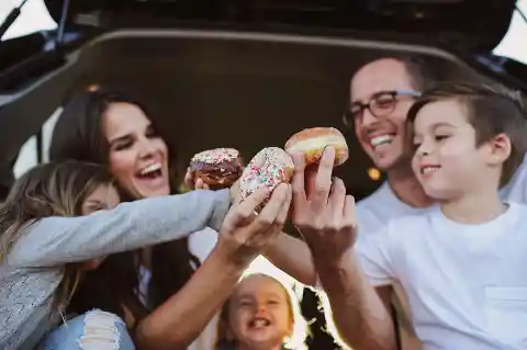
It goes straight to your emotions, and this is how a simple donut is turned into a story which might have been stretched just to mislead and manipulate you into buying that one instead of the other one, even if they both look the same.
17. ONE TIME OFFERS
Sometimes, we end up buying the same thing we have, but slightly different, because it was “on sale.” And did you notice that ads display one-time offers or things you can only buy on a certain day – because let’s face it, who wants to buy things on a Monday?

Well, you’ll soon realize that you’re buying that item at the same price, no matter the day you get it. Some ads publish content on Tuesdays so that people can share it throughout a week and probably end up buying them over the weekend.
16. WE LIKE RHYMES
Do we? You might not have paid attention to the slogans and jungles around you, but they rhyme just for the purpose of being catchy and fun.
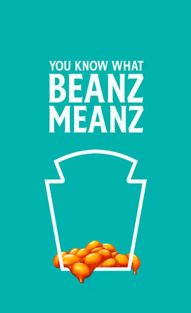
They’re readily accepted by the public, and they easily get stuck in your head: “The best part of waking up is Folgers in your cup.” See? Now let’s check out some Photoshop skills…
15. BEAUTY PRODUCTS
The standard in commercials and ads is to use filters and Photoshop to erase some features considered flaws to make the people on screen look perfect.


It was not a dangerous thing to adjust some photos, but the American Medical Association concluded that many adolescents’ health was in danger, making them wish to be as perfect as the photos in the ads. Talking about photos and Photoshop…
14. BEST BURGER EVER
The advertisement is so far from reality when it comes to fast food, hotels, children’s toys, and products and so many other products. Anyone who’s eaten a burger at fast food and looked at the ad has seen the huge difference between ad and reality.
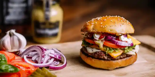

Did you know that ads use hairspray on fruits to make them look fresh? Ice cream is replaced with mashed potatoes so that it won’t melt during the commercial – or this pancake trick at #9.
13. EVOLUTION OF COMMERCIALS
People have stopped watching commercials ever since they taped their favorite shows, watched YouTube content and skipped the ad, used Netflix or other TV apps. But let’s talk about how commercials still creep into our lives.


It’s called product placement, and it’s the evolved form of commercials. Some shows get paid to feature some products during the episode, and you just end up seeing it…
12. COLORS AND MARKETING
Life is filled with colors, and they’re usually altering our mood. Spend time in a blue room, and you’ll be so calm and confident. Corporate logos use a blue color to deliver confidence to the public.
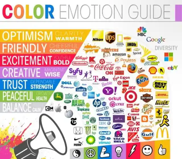
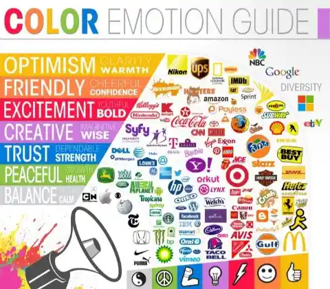
They also appeal to men, as blue is a masculine color. Red is the next one, mainly used in food commercials because it induces hunger and it grabs your attention very fast.
11. SMILING AND BEING POSITIVE
Who doesn’t like seeing people smiling and happy stories on the internet? The same goes for commercials and ads.


Positive content evokes laughter and is shared on social media more than negative content, and it’s not us saying it, it’s a study that analyzed more than 100 headlines and other similar surveys. Happy sells, and so does the next trick…
10. SHOCKING FACTS
Media also likes to shock the viewers. Even though there might be negative things, they’re unforgettable and have a lasting impression.


A brand will surely be memorable after it has shared a shocking ad. Whenever you see a similar negative image, that product will be the first one to think of, right? Now check out these yummy pancakes!
9. YUMMY PANCAKE SYRUP...
Wait, what do you mean by yummy pancake syrup? Oh, this awesome gooey thing that is surely motor oil because is thicker than most of the syrups and makes photographs look better?
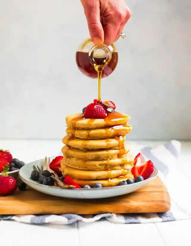
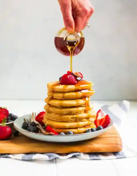
Keep those pancakes firm for the photo shoot with some fabric protectors and please don't eat them at the end of the shooting!
7. SIMPLE LOGOS
Some logos use letters, some use images, but lately, they have all started to look a bit similar – and they don’t stand out too much. Why is that, when as a brand standing out is the idea?
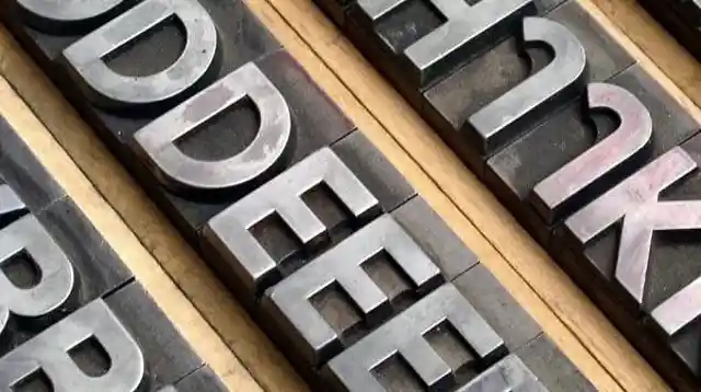

A less loud and flashy logo shows that the brand is not fighting for attention. Sleek and sans serif text is the definition of a trusted brand.
8. SEX SELLS
We’re easy to read, and that’s because our instinct is quite similar to a caveman’s. The brain reacts best to three things: food, sex or danger. So, whatever image which includes one of these will be appealing.


This is why companies use one or two of these to make us more interested in the product – like a skateboarder doing awesome tricks (danger) and drinking Mountain Dew in an ad.
6. THE PRECIOUS RING
Engagement rings have been a symbol of love and being devoted to your significant other. It was also a sign showing that couples were ready for the next step towards marriage.


But how come the ring has become more important than the wedding dress or the special event? It’s all “tanks” to the 1930s campaign started by the diamond company De Beers. So which is forever – Diamonds or love?
5. STEAMY FOOD
Most of the commercials you’ve seen in the restaurants want to show you a fresh plate of warm food just taken out of the oven. But to get the perfect shot, the food gets cold, and there is no steam for the wow factor.

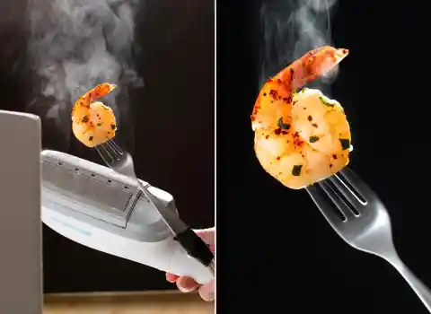
However, a hand steamer placed behind the plate will easily add the steam. And if it’s just a photo, you can use a special brush in Photoshop!
4. GREEN LABELS
We talked about the colors red and blue, but what about the green labels? They make you think of natural foods, of things that mother nature provides, of things that are healthy.

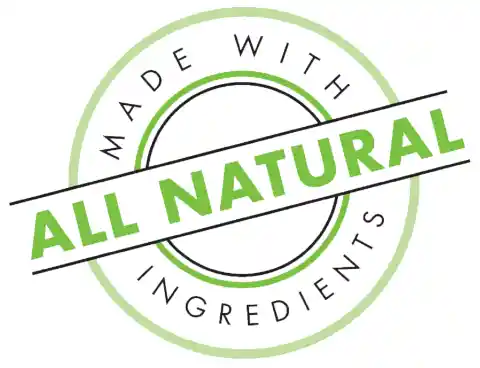
Green also means money and “go” for it. Next time, look at the labels and wherever you see green ask yourself: “Is it really good for me?”
3. COOL BRANDS
The brands that try to be popular for buyers appear as being “cool.” They sometimes look as if they’re against social norms, or that they’re for the “Average Joes,” but that’s exactly part of the marketing.


In other words, the whole point of this strategy is to make the product seem more appealing for the average consumer.
2. GRILLED MEAT
The best photographs of a nicely charred burger are probably some burger meat dipped in shoe polish to make it look perfectly cooked.
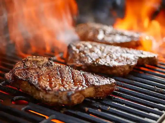
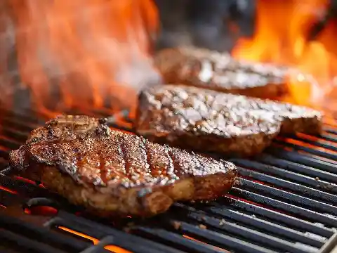
And since grills already make you think of fun parties with friends, the nice image is inviting the buyer to get the perfect food.
1. THE HAPPY DISNEY DREAM
Disney parks make you think of fantasy and dreams, of all the childhood memories while you were watching the animation. And the commercials do not make you feel any less than in a dream: they're filled with families enjoying the parks and seeing the princesses and fairies.

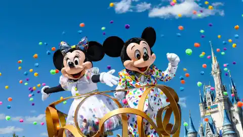
However, that's all the decades-old Disney campaigns that have made sure we associate fantasy with the brand.